
Think about the last time you opened a company’s website on your phone and had to pinch, zoom and scroll sideways just to read a price list. Chances are you gave up within seconds and tried a competitor instead. Your customers do exactly the same. People check businesses on phones during their commute, on tablets at home and on laptops at work, often switching between them in a single day. A site that only looks right on one screen quietly loses visitors on all the others.
That’s why responsive web design has become a basic expectation rather than a nice extra. In this guide, we cover what it is, why it matters for users and for your credibility, how it connects with SEO, how to test your own site, and which mistakes to avoid. We’ll also explain how The Bharat Solutions can help if you’d rather not handle it alone.
What Is Responsive Web Design and How Does It Work?
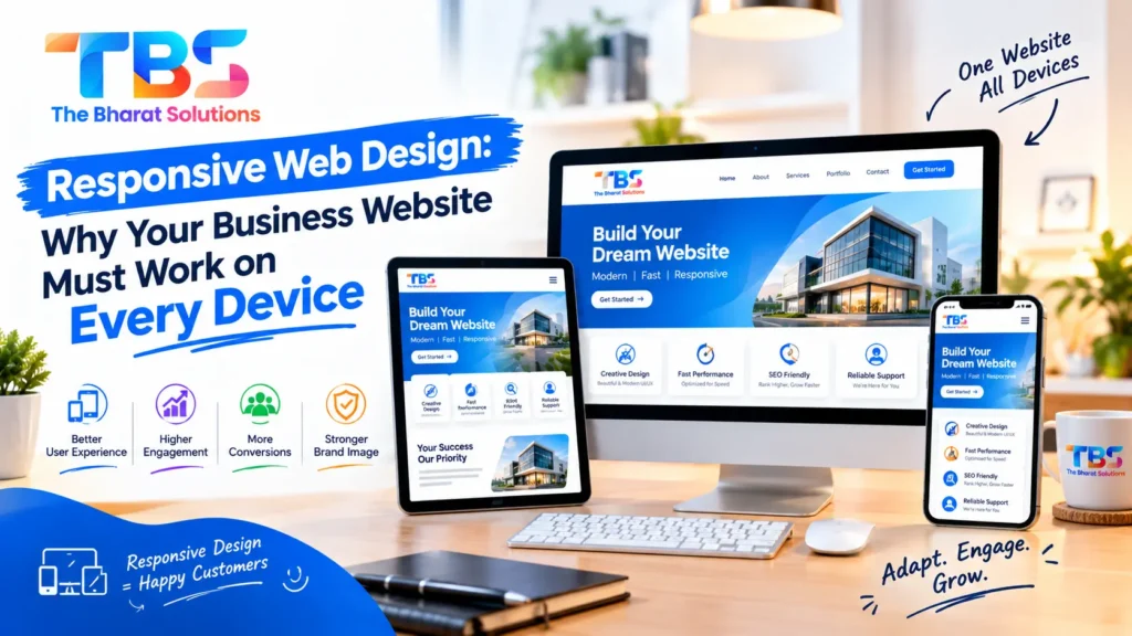
Responsive web design is an approach where a single website adjusts its layout to suit whatever screen it’s shown on. The same page rearranges itself on a desktop monitor, a tablet and a smartphone, so nobody has to zoom in or scroll sideways.
Behind the scenes, this relies on flexible website layouts built with fluid grids, images that scale inside their containers, and CSS media queries that apply different styling at different screen widths. A three-column layout on a desktop might become two columns on a tablet and one stacked column on a phone. Menus shrink into a tap-friendly icon, and buttons grow big enough for a thumb. This screen size adaptation happens automatically, which is why you maintain one website instead of separate versions for each device.
You’ll hear agencies call this responsive website design, and some people say mobile responsive design for the same idea. The goal is identical: a consistent experience, whatever the device.
What Changes on Each Device
- Desktop: wider layouts, multiple columns, more room for imagery and side content.
- Tablet: touch-friendly menus and flexible columns that cope with both portrait and landscape.
- Smartphone: a single column, larger buttons, simplified menus and the most important content first.
Key Benefits for User Experience, Engagement and Business Credibility
Better User Experience
When text is readable and buttons are easy to tap, visitors can focus on what you offer instead of fighting the page. This kind of user experience optimisation reduces frustration and makes the mobile browsing experience feel natural. Nobody praises a website for working properly, but everybody notices when it doesn’t.
Stronger Engagement
A comfortable site makes it easier for visitors to read more, explore other pages and take action, whether that’s calling you, booking a visit or sending an enquiry. Making those steps simple supports your conversion optimisation efforts, although results always depend on your offer, pricing and market.
Business Credibility
A site that breaks on a phone suggests carelessness, and a tidy, consistent one suggests the opposite. If you’re asking people to trust you with their money, first impressions count. Thoughtful business website design shows you pay attention to detail, and cross-device compatibility means every visitor sees the same professional picture, not just the ones with a desktop.
Layouts, Text, Navigation and Speed That Make the Difference
Layouts and Readable Text
A mobile-friendly website is far more than a shrunken desktop page. Text should be readable without zooming, with a comfortable font size and enough line spacing. Keep paragraphs short, leave breathing room around elements, and make sure there’s strong contrast between text and background.
User-Friendly Navigation
Menus should have clear labels and buttons large enough to tap without hitting the wrong one. User-friendly navigation means a visitor can reach your contact page or main services in a couple of taps. If people can’t find your phone number quickly, they won’t hunt for it.
Image Optimisation
Heavy images are one of the most common reasons pages feel slow on a phone. Compress them, serve appropriately sized versions for each screen, and avoid uploading a huge photo when a small one will do. Adding descriptive alt text also supports website accessibility, because it helps people using screen readers understand what an image shows.
Website Loading Speed
Mobile networks aren’t always fast, and people are impatient. Slow pages frustrate visitors, so keep scripts lean, avoid unnecessary plugins and use caching where it makes sense. Website loading speed isn’t just a technical number. It’s part of how your business feels to the person waiting.
How Responsive Design Supports SEO and Mobile Usability
Search engines want to show pages that work for the person searching. Google has said it mainly uses the mobile version of a page for indexing, which is one reason many teams now follow mobile-first web design, planning for the smallest screen first and then scaling up. A site with solid mobile compatibility is simply easier for both people and crawlers to use. Having one address and one set of content for all devices is also simpler to manage than a separate mobile site.
That said, design alone doesn’t decide rankings. Content quality, relevance, links and many other factors all play a part, and nobody can promise a particular position on a results page. Think of responsive design as removing obstacles, not as a shortcut.
Practical Ways to Check Whether Your Website Is Responsive
Checking website responsiveness doesn’t take long, and it tells you a lot. Try this:
- Open your site on your own phone and tablet, in both portrait and landscape.
- On a desktop, drag the browser window narrower and watch how the layout reacts.
- Use the device mode in your browser’s developer tools to preview different screen sizes.
- Test in more than one browser, such as Chrome, Safari and Edge.
- Fill in your contact form and tap every menu item on a phone.
- Run Google PageSpeed Insights to spot speed and usability issues.
- Ask a friend or colleague to try it and tell you what felt awkward.
If any step has you pinching or squinting, the site isn’t a truly mobile-friendly website yet. Emulators are handy, but real devices catch things they miss, so test on a few actual phones if you can.
Common Responsive Design Mistakes and How to Avoid Them
Most problems with mobile responsive design come from rushed decisions, not complicated technology. Here are the ones we see most often.
Hiding Important Content on Mobile
Some sites remove sections on small screens to save space. Visitors on phones then miss details that desktop users see. Instead of deleting content, prioritise it, collapse it into sections or rewrite it to be shorter.
Tiny Buttons and Cramped Menus
If your buttons are too small or too close together, people tap the wrong thing and get annoyed. Give links and buttons enough space to tap comfortably.
Oversized Images and Slow Pages
Large, uncompressed images slow everything down. Optimise them before uploading and avoid loading more than a page really needs.
Fixed Widths and Intrusive Pop-ups
Elements locked to a fixed width spill off small screens, and pop-ups that cover the whole page are hard to close on a phone. Good responsive website design uses flexible measurements and keeps pop-ups small and easy to dismiss.
Testing on Only One Device
A site that looks perfect on your own phone may break on another. Test across screen sizes, browsers and orientations before launch, and again after any big update.
How The Bharat Solutions Can Help You Build a User-Friendly Website
A good website needs more than a nice homepage. It needs planning, clean code, tested layouts and someone who thinks about the visitor’s journey. The team works as a web development company in Ahmedabad, designing and building websites for businesses, with attention to how each page behaves on phones, tablets and desktops.
The team’s approach to business website design starts with your customers: who they are, what devices they use and what they need to do on your site. From there, the work moves into mobile-first web design, where layouts are planned for small screens first and then expanded for larger ones, followed by testing on real devices and common browsers. Depending on your needs, this can sit within broader website development services, covering responsive website design, user experience optimisation and attention to speed and accessibility.
A well-built site gives your marketing a solid base, but nobody can honestly guarantee rankings, traffic or sales. Those still depend on your content, your competition and how you promote your business.
Frequently Asked Questions
1. What is responsive web design, and why does it matter?
It’s a way of building a website so the layout adjusts automatically to different screen sizes. It matters because your visitors use phones, tablets and computers, and each of them should get a comfortable experience.
2. Is a responsive website the same as a mobile-friendly website?
Not exactly. Responsive design is one way to achieve a mobile-friendly result, using a single flexible site for every device. A site can be mobile-friendly in other ways, but one responsive site is usually easier to maintain.
3. Does responsive design help SEO?
It can support SEO by giving users a smoother experience and keeping your content on a single address. It doesn’t guarantee higher rankings, though. Content quality, relevance and other factors matter too.
4. How much does responsive website design cost?
There’s no single price. The cost depends on the number of pages, the amount of custom design, features such as forms or booking tools, and the content you need. A reliable quote comes after you’ve explained your requirements to a provider of website development services.
5. Will my website work on every device and browser?
A well built site should work across common screen sizes and major browsers. It’s not realistic to test every device ever made, so good cross-device compatibility comes from testing the most popular combinations among your own visitors.